A NEW NEWCASTLE
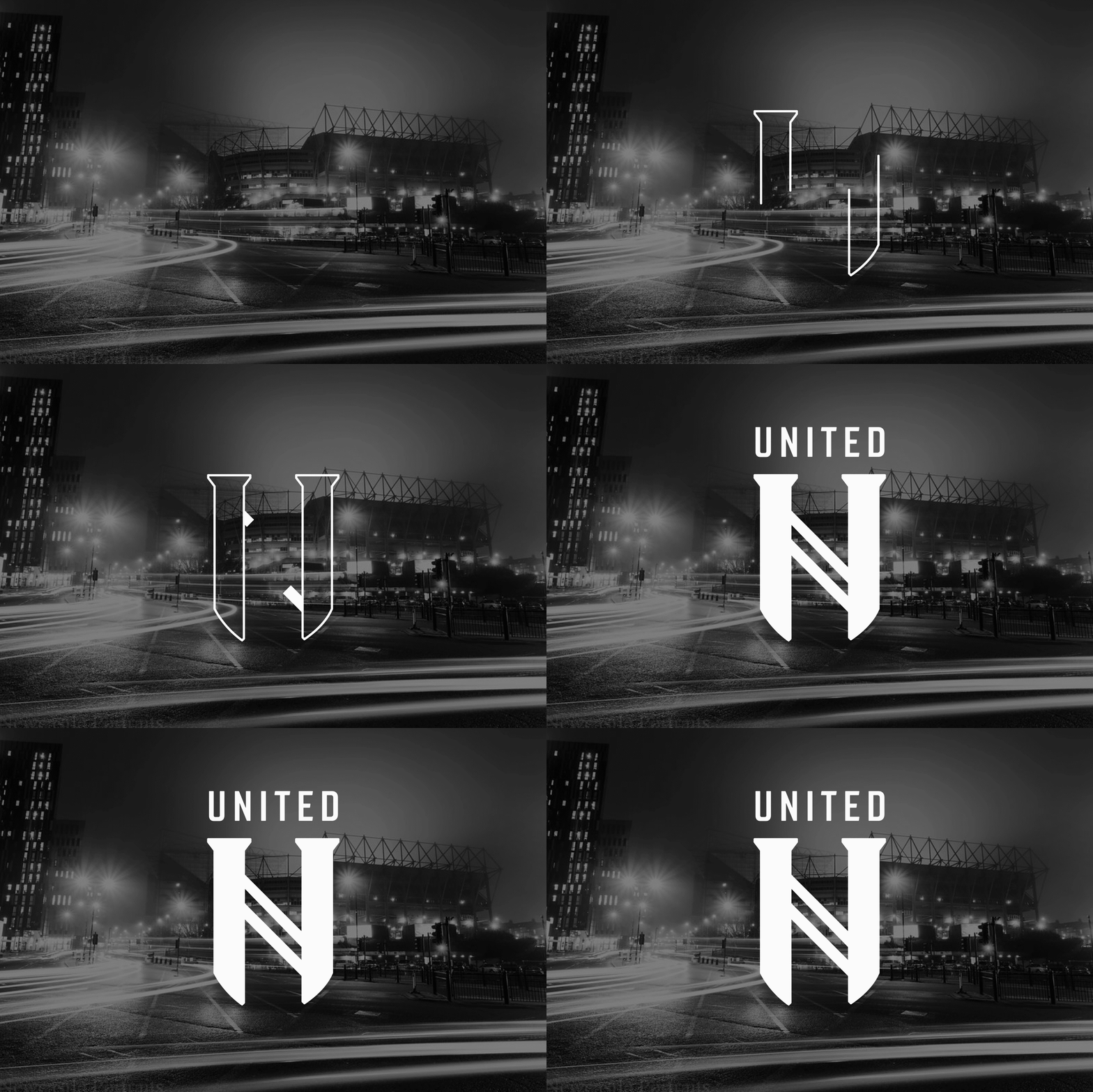
A recent project I undertook to rebrand my beloved Newcastle United after a trip to the Allianz Arena in Turin.
Paring back the many elements currently within Newcastle United’s crest, I aimed to make a minimalist typographic solution for a more contemporary rebrand. Using the letter form’s serifs to suggest castle turrets, I wanted a focus on the unification of Newcastle East & West in 1892 and how they are now connected by the black & white stripes of NUFC - which in turn shines a spotlight on what makes Newcastle special; it is one club, for one city.


